![]()
RedWine Dataset
Redwine is a simple and clean practice dataset for data science problems using regression or classification modelling. The classes are ordered and not balanced (e.g. there are much more normal wines than excellent or poor ones).
Input variables or features in redwine dataset (based on physicochemical tests) are :-
1 – fixed acidity
2 – volatile acidity
3 – citric acid
4 – residual sugar
5 – chlorides
6 – free sulfur dioxide
7 – total sulfur dioxide
8 – density
9 – pH
10 – sulphates
11 – alcohol
Output variable (based on sensory data) :-
12 – quality (score between 0 and 10)
Step 1 Examine Data
Data will be typically examined by first looking at a few rows, finding dimensions of the data, looking at data types and names of the columns,
Use the following python commands to examine data :-
df = pd.read_csv(‘../input/red-wine-quality-cortez-et-al-2009/winequality-red.csv’)
df.head()

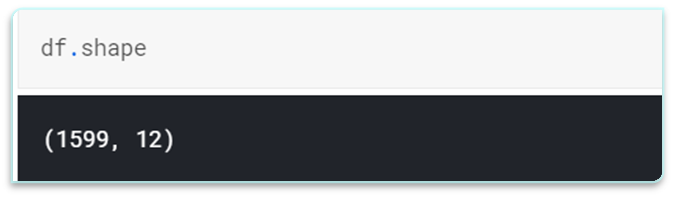
Find total number of rows and columns in the dataset using shape attribute
It is also a good practice to know the columns and their corresponding data types, along with finding whether they contain null values or not.

Step 2 Descriptive Statistics
Descriptive statistics can give you great insight into the shape of each attribute.
Often you can create more summaries than you have time to review. The describe() function on the Pandas DataFrame lists 8 statistical properties of each attribute:
a). Count
b). Mean
c). Standard Deviation
d). Minimum Value
e). 25th Percentile
f). 50th Percentile (Median)
g). 75th Percentile
h). Maximum Value

There is notably a large difference between 75th %tile and max values of predictors “residual sugar”,”free sulfur dioxide”,”total sulfur dioxide”. Thus observation suggests that there are extreme values-Outliers in our data set.
Step 3 Understanding Target Variable
Few key insights just by looking at dependent variable. Target variable/Dependent variable is discrete and categorical in nature.
“quality” score scale ranges from 1 to 10;where 1 being poor and 10 being the best.
df.quality.unique()

df.quality.value_counts()

Step 4 Checking Correlation
To use linear regression for modelling, its necessary to remove correlated variables to improve your model. One can find correlations using pandas “.corr()” function and can visualize the correlation matrix using a heatmap in seaborn.
sns.heatmap(df.corr(),cmap=’viridis’, annot=False)
Dark shades represents positive correlation while lighter shades represents negative correlation.
If you set annot=True, you’ll get values by which features are correlated to each other in grid-cells.
1). Here we can infer that “density” has strong positive correlation with “residual sugar” whereas it has strong negative correlation with “alcohol”.
2). “free sulphur dioxide” and “citric acid” has almost no correlation with “quality”.
3). Since correlation is zero we can infer there is no linear relationship between these two predictors. However it is safe to drop these features in case you’re applying Linear Regression model to the dataset.

Step 5 Checking Outliers
This is a commonly overlooked mistake we tend to make. The temptation is to start building models on the data you’ve been given. But that’s essentially setting yourself up for failure.
Data exploration consists of many things, such as variable identification, treating missing values, feature engineering, etc.
Detecting and treating outliers is also a major cog in the data exploration stage.
The quality of your inputs decide the quality of your output!
l = df.columns.values
number_of_columns=12
number_of_rows = len(l)-1/number_of_columns
plt.figure(figsize=(number_of_columns,5*number_of_rows))
for i in range(0,len(l)):
plt.subplot(number_of_rows + 1,number_of_columns,i+1)
sns.set_style(‘whitegrid’)
sns.boxplot(df[l[i]],color=’green’,orient=’v’)
plt.tight_layout()

Step 6 Skewness and Kurtosis
plt.figure(figsize=(2*number_of_columns,5*number_of_rows))
for i in range(0,len(l)):
plt.subplot(number_of_rows + 1,number_of_columns,i+1)
sns.distplot(df[l[i]],kde=True)
print(“Skewness \n “,df.skew())
print(“\n Kurtosis \n “, df.kurt())


Other Interesting Articles
Introducing Data Science Gym – Technology Magazine (tech-mags.com)