![]()
Introduction
Data analysis is a process for obtaining raw data and converting it into information useful for decision-making by users. Data is collected and analyzed to answer questions, test hypotheses or disprove theories.
Data scientists live at the intersection of coding, statistics, and critical thinking. As Josh Wills put it, “data scientist is a person who is better at statistics than any programmer and better at programming than any statistician.”
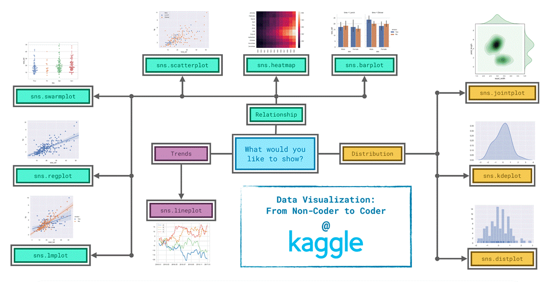
Since it’s not always easy to decide how to best tell the story behind your data, we’ve broken the chart types into three broad categories to help with this.
Trends – A trend is defined as a pattern of change.
sns.lineplot – Line charts are best to show trends over a period of time, and multiple lines can be used to show trends in more than one group.
Relationship – There are many different chart types that you can use to understand relationships between variables in your data.
sns.barplot – Bar charts are useful for comparing quantities corresponding to different groups.
sns.heatmap – Heatmaps can be used to find color-coded patterns in tables of numbers.
sns.scatterplot – Scatter plots show the relationship between two continuous variables; if color-coded, we can also show the relationship with a third categorical variable.
sns.regplot – Including a regression line in the scatter plot makes it easier to see any linear relationship between two variables.
sns.lmplot – This command is useful for drawing multiple regression lines, if the scatter plot contains multiple, color-coded groups.
sns.swarmplot – Categorical scatter plots show the relationship between a continuous variable and a categorical variable.
Distribution – We visualize distributions to show the possible values that we can expect to see in a variable, along with how likely they are.
sns.distplot – Histograms show the distribution of a single numerical variable.
sns.kdeplot – KDE plots (or 2D KDE plots) show an estimated, smooth distribution of a single numerical variable (or two numerical variables).
sns.jointplot – This command is useful for simultaneously displaying a 2D KDE plot with the corresponding KDE plots for each individual variable.
Setting the Style of the Figure
We can quickly change the style of the figure to a different theme with only a single line of code.
Seaborn has five different themes: (1)”darkgrid”, (2)”whitegrid”, (3)”dark”, (4)”white”, and (5)”ticks”, and you need only use a command similar to the one in the code cell above (with the chosen theme filled in) to change it.
# Change the style of the figure to the “dark” theme
sns.set_style(“dark”)
# Line chart
plt.figure(figsize=(12,6))
sns.lineplot(data=spotify_data)
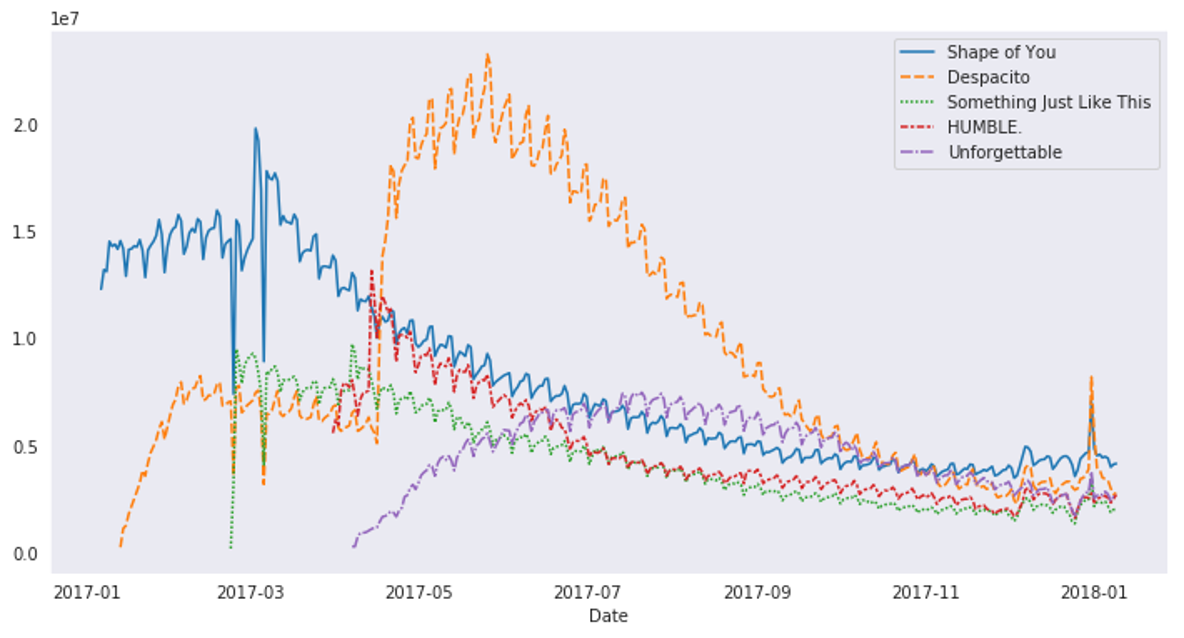
Line Plot for Subset of Data
# Set the width and height of the figure
plt.figure(figsize=(14,6))
# Add title
plt.title(“Daily Global Streams of Popular Songs in 2017-2018”)
# Line chart showing daily global streams of ‘Shape of You’
sns.lineplot(data=spotify_data[‘Shape of You’], label=”Shape of You”)
# Line chart showing daily global streams of ‘Despacito’
sns.lineplot(data=spotify_data[‘Despacito’], label=”Despacito”)
# Add label for horizontal axis
plt.xlabel(“Date”)

Bar Plot
# Path of the file to read
ign_filepath = “../input/ign_scores.csv”
# Fill in the line below to read the file into a variable ign_data
ign_data = pd.read_csv(ign_filepath, index_col=”Platform”)
# Set the width and height of the figure
plt.figure(figsize=(8, 6))
# Bar chart showing average score for racing games by platform
sns.barplot(x=ign_data[‘Racing’], y=ign_data.index)
# Add label for horizontal axis
plt.xlabel(“”)
# Add label for vertical axis
plt.title(“Average Score for Racing Games, by Platform”)

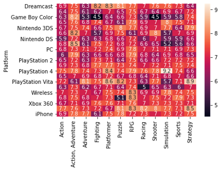
Heatmap
# Heatmap showing average game score by platform and genre
sns.heatmap(data=ign_data, annot=True)
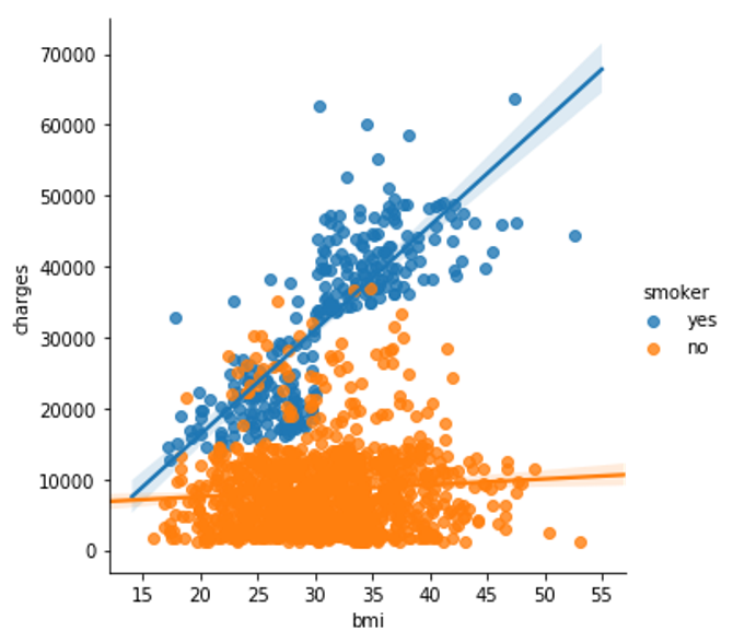
Scatter Plots
To create a simple scatter plot, we use the sns.scatterplot command and specify the values for:
1). the horizontal x-axis (x=insurance_data[‘bmi’]), and
2). the vertical y-axis (y=insurance_data[‘charges’]).
sns.scatterplot(x=insurance_data[‘bmi’], y=insurance_data[‘charges’])
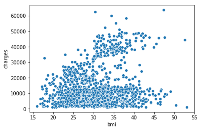
The scatterplot above suggests that body mass index (BMI) and insurance charges are positively correlated, where customers with higher BMI typically also tend to pay more in insurance costs. (This pattern makes sense, since high BMI is typically associated with higher risk of chronic disease.)
Problem
Do people tend to prefer candies with higher sugar content?
# Scatter plot showing the relationship between ‘sugarpercent’ and ‘winpercent’
sns.scatterplot(x=candy_data[‘sugarpercent’],y=candy_data[‘winpercent’])
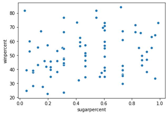
Does the scatter plot show a strong correlation between the two variables? If so, are candies with more sugar relatively more or less popular with the survey respondents?
Explanation
The scatter plot does not show a strong correlation between the two variables. Since there is no clear relationship between the two variables, this tells us that sugar content does not play a strong role in candy popularity.
Code 2
# Scatter plot w/ regression line showing the relationship between ‘sugarpercent’ and ‘winpercent’
sns.regplot(x=’sugarpercent’,y=’winpercent’, data = candy_data)

According to the plot above, there is a slight correlation between ‘winpercent’ and ‘sugarpercent’.
Color-Coded Scatter Plots
We can use scatter plots to display the relationships between (not two, but…) three variables!
One way of doing this is by color-coding the points.
For instance, to understand how smoking affects the relationship between BMI and insurance costs, we can color-code the points by ‘smoker’, and plot the other two columns (‘bmi’, ‘charges’) on the axes.
sns.scatterplot(x=insurance_data[‘bmi’], y=insurance_data[‘charges’], hue=insurance_data[‘smoker’])

This scatter plot shows that while nonsmokers to tend to pay slightly more with increasing BMI, smokers generally pay higher charges than non-smokers.
To further emphasize this fact, we can use the sns.lmplot command to add two regression lines, corresponding to smokers and nonsmokers. (You’ll notice that the regression line for smokers has a much steeper slope, relative to the line for nonsmokers!)
sns.lmplot(x=”bmi”, y=”charges”, hue=”smoker”, data=insurance_data)
The sns.lmplot command above works slightly differently than the commands you have learned about so far:
Instead of setting x=insurance_data[‘bmi’] to select the ‘bmi’ column in insurance_data, we set x=”bmi” to specify the name of the column only.
Similarly, y=”charges” and hue=”smoker” also contain the names of columns.
We specify the dataset with data=insurance_data.
Problem
Using the regression lines, what conclusions can you draw about the effects of chocolate and price on candy popularity?
Code
# Color-coded scatter plot w/ regression lines
sns.lmplot(x=’pricepercent’, y=’winpercent’, hue= ‘chocolate’, data=candy_data)
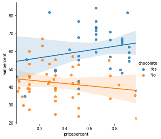
Solution
We’ll begin with the regression line for chocolate candies. Since this line has a slightly positive slope, we can say that more expensive chocolate candies tend to be more popular (than relatively cheaper chocolate candies). Likewise, since the regression line for candies without chocolate has a negative slope, we can say that if candies don’t contain chocolate, they tend to be more popular when they are cheaper. One important note, however, is that the dataset is quite small — so we shouldn’t invest too much trust in these patterns! To inspire more confidence in the results, we should add more candies to the dataset.
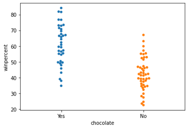
Categorical Scatter Plot
Finally, there’s one more plot that you’ll learn about, that might look slightly different from how you’re used to seeing scatter plots. Usually, we use scatter plots to highlight the relationship between two continuous variables (like “bmi” and “charges”). However, we can adapt the design of the scatter plot to feature a categorical variable (like “smoker”) on one of the main axes.
We’ll refer to this plot type as a categorical scatter plot, and we build it with the sns.swarmplot command.
sns.swarmplot(x=insurance_data[‘smoker’], y=insurance_data[‘charges’])

Analysis
This graph clearly shows that smokers have to pay higher insurance charges as compared to non-smokers.
Problem
Create a categorical scatter plot to highlight the relationship between ‘chocolate’ and ‘winpercent’. Put ‘chocolate’ on the (horizontal) x-axis, and ‘winpercent’ on the (vertical) y-axis.
Answer
# Scatter plot showing the relationship between ‘chocolate’ and ‘winpercent’
sns.swarmplot(x=candy_data[‘chocolate’], y=candy_data[‘winpercent’])
Related
Learning Exploratory Data Analysis Using Redwine Dataset – Technology Magazine (tech-mags.com)
https://www.kaggle.com/hassanamin/exercise-scatter-plots/edit
https://www.kaggle.com/hassanamin/exercise-distributions/edit