![]()
Introduction
Matplotlib is a cross-platform, data visualization and graphical plotting library for Python and its numerical extension NumPy. As such, it offers a viable open source alternative to MATLAB. Developers can also use matplotlib’s APIs (Application Programming Interfaces) to embed plots in GUI applications.
A Python matplotlib script is structured so that a few lines of code are all that is required in most instances to generate a visual data plot.
Matplotlib is a comprehensive library for creating static, animated, and interactive visualizations in Python. Matplotlib makes easy things easy and hard things possible.
- Create publication quality plots.
- Make interactive figures that can zoom, pan, update.
- Customize visual style and layout.
- Export to many file formats .
- Embed in JupyterLab and Graphical User Interfaces.
- Use a rich array of third-party packages built on Matplotlib.
Using Style Sheets
The style package adds support for easy-to-switch plotting “styles” with the same parameters as a matplotlib rc file (which is read at startup to configure matplotlib).
There are a number of predefined styles provided by Matplotlib. For example, there’s a predefined style called “ggplot”, which emulates the aesthetics of ggplot (a popular plotting package for R).
To use this style, just add:
import numpy as np
import matplotlib.pyplot as plt
import matplotlib as mpl
from cycler import cycler
plt.style.use(‘ggplot’)
data = np.random.randn(50)
To list all available styles, use:
print(plt.style.available)
Using Style of Your Choice
import matplotlib.pyplot as plt
plt.style.use(‘fivethirtyeight’)
Basic Visualization with Matplotlib
Matplotlib is probably the single most used Python package for 2D-graphics. It provides both a very quick way to visualize data from Python and publication-quality figures in many formats.
$ python
>>> import numpy as np
>>> import pylab as pl
You can also check which versions you have installed by doing:
>>> import numpy
>>> numpy.__version__
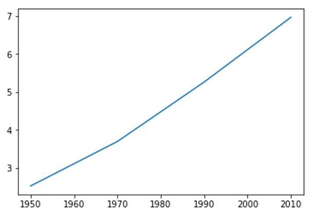
Simple Line Plot
import matplotlib.pyplot as plt
year = [1950, 1970, 1990, 2010]
pop = [2.519, 3.692, 5.263, 6.972]
plt.plot(year, pop)
plt.show()
Adding Axis, Title and Ticks to Line Graph
# Simple Line Plot with Axis Labels and Title
import matplotlib.pyplot as plt
year = [1950, 1970, 1990, 2010]
pop = [2.519, 3.692, 5.263, 6.972]
plt.plot(year, pop)
#Adding Axis Labels
plt.xlabel(‘Year’)
plt.ylabel(‘Population’)
plt.title(‘World Population Projections’)
plt.yticks([0,2,4,6,8,10])
#Show
plt.show()

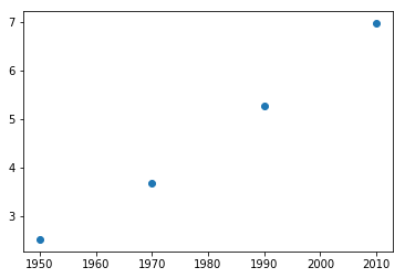
Creating Scatter Plot
import matplotlib.pyplot as plt
year = [1950, 1970, 1990, 2010]
pop = [2.519, 3.692, 5.263, 6.972]
plt.scatter (year, pop)
plt.show()
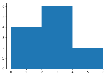
Creating Histogram
import matplotlib.pyplot as plt
values = [0,0.6,1.4,1.6,2.2,2.5,2.6,3.2,3.5,3.9,4.2,6]
plt.hist(values, bins = 3)
plt.show()
Advance Data Visualization
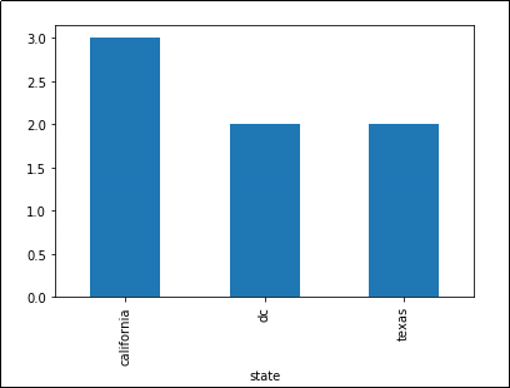
Bar plot with groupby
import matplotlib.pyplot as plt
import pandas as pd
df.groupby(‘state’)[‘name’].nunique().plot(kind=’bar’)
plt.show()
Sort Groupby Results
Turn the GroupBy object into a regular dataframe by calling .to_frame() and then reindex with reset_index(), then you call sort_values() as you would a normal DataFrame:
import pandas as pd
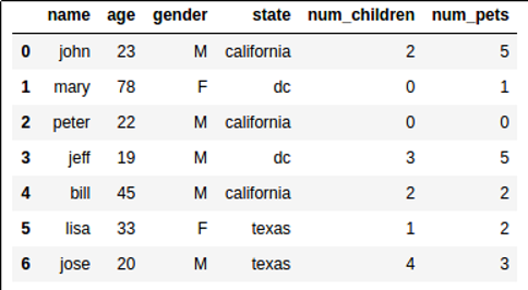
df = pd.DataFrame({
‘value’:[20.45,22.89,32.12,111.22,33.22,100.00,99.99],
‘product’:[‘table’,’chair’,’chair’,’mobile phone’,’table’,’mobile phone’,’table’]
})
df1 = df.groupby(‘product’)[‘value’].sum().to_frame().reset_index()
df2 = df.groupby(‘product’)[‘value’].sum().to_frame().reset_index()
Related
Learning to Use Numpy Library in Python with Code Examples – Technology Magazine (tech-mags.com)
Learning Exploratory Data Analysis Using Redwine Dataset – Technology Magazine (tech-mags.com)